On the day before our shoot day we went
into the studio and began setting up some of the sets for the next day. We
moved around lights, props and pieces of set, so that the studio was clear for
our set builds. We set up the wheel, which was the first element we were going
to shoot. Additonally, because of its size and weight we needed to film it
first, then destroy it and build the next set.


We tested out the lighting behind the wheel. We wanted to use the 'Pixelline 1044', because it can change to different colours and it can create complicated patterns and effects. The ‘Pixelline 1044’ compromises of long bars made of small LED lights, when put together they can form a pixel effect and can change colour and design. This makes it possible to have a light show made of LED lights. We selected the lighting effects we wanted, such as the turquoise blue, pink and blue/pink colour blend.


However, we did run into some problems, the two main dancers who had spent several weeks perfecting the choreography, were sent home because they were ill; the night before the shoot. Due to the unforeseen cicumstances, we desperately looked for 2 dancers who could learn the choreography. We notified Charlotte Mcghee and Alice Marriott, who were in dance company.


Lottie (head of dance company) was incredibly helpful in taking time out of dance company rehersals to teach the choreography to the dancers. Nonetheless, the new dancers had only spent 20 minutes the night before the shoot learning the dance, they still needed to practice on the morning on the shoot, so that they could be in-sync.


We tested out the lighting behind the wheel. We wanted to use the 'Pixelline 1044', because it can change to different colours and it can create complicated patterns and effects. The ‘Pixelline 1044’ compromises of long bars made of small LED lights, when put together they can form a pixel effect and can change colour and design. This makes it possible to have a light show made of LED lights. We selected the lighting effects we wanted, such as the turquoise blue, pink and blue/pink colour blend.
'Pixelline 1044'


However, we did run into some problems, the two main dancers who had spent several weeks perfecting the choreography, were sent home because they were ill; the night before the shoot. Due to the unforeseen cicumstances, we desperately looked for 2 dancers who could learn the choreography. We notified Charlotte Mcghee and Alice Marriott, who were in dance company.


Lottie (head of dance company) was incredibly helpful in taking time out of dance company rehersals to teach the choreography to the dancers. Nonetheless, the new dancers had only spent 20 minutes the night before the shoot learning the dance, they still needed to practice on the morning on the shoot, so that they could be in-sync.
I woke up the morning of our shoot feeling
extremely stressed and anxious. There were a lot of last minute changes and
problems that arose the night before and there were a lot of things to do
before the shoot started. When I got to school, I made sure that I spoke to the
rapper to inform him of what time we needed him. We also needed to find an
armchair for one of the set builds. Saskia and I went up to the main school
building and borrowed an armchair from the principals office.


Lastly, the
dancers and lead singer also had to get into hair and make-up; and the dancers
needed to rehearse the choreography for the shoot.


When we got into the studio the wheel was
set up, and the tall black curtains had been drawn over the wheel structure of
the wheel; to block out the light from the back. We set up the camera and
tested the lights behind the wheel another time. We found that the inside of
the wheel, reflected the light very well, and created a soft light box effect
on anything that was inside. We decided to also film the actors inside the
wheel. This is because it lit them perfectly and created interesting shadows,
which fit with mysterious concept of out music video. In addition the wheel and silhouettes it
created of the dancers, was exactly what we imagined in our concept.


Before the shoot day even began we decided in our groups the roles we would do. Saskia would be in charge of art direction/playback, Ella would be in charge of camera and I would take the role of director. We were consistent and followed the roles we assigned ourselves on the shoot day. Additonally, we helped each other out in the roles; sometimes Ella would direct a moment; I would help Saskia with deciding on make-up choices and Saskia would help out with the camera. As the director, my role was to make sure everything was running smoothly. I also helped the dancers/actors, and gave them advice on how we wanted them to act. I stood behind the camera, giving dirctons to the actors and helping Ella. In total, we divided the roles evenly and everyone was able to try different roles throughout the day.


Before the shoot day even began we decided in our groups the roles we would do. Saskia would be in charge of art direction/playback, Ella would be in charge of camera and I would take the role of director. We were consistent and followed the roles we assigned ourselves on the shoot day. Additonally, we helped each other out in the roles; sometimes Ella would direct a moment; I would help Saskia with deciding on make-up choices and Saskia would help out with the camera. As the director, my role was to make sure everything was running smoothly. I also helped the dancers/actors, and gave them advice on how we wanted them to act. I stood behind the camera, giving dirctons to the actors and helping Ella. In total, we divided the roles evenly and everyone was able to try different roles throughout the day.
Saskia working on playback

Ella working on camera

I felt that I personally worked well with
the actors and gave good direction on how we wanted them to act and behave
infront of the camera. When the dancers were in the wheel I was behind the
camera, doing dance moves and different poses for the dancers to copy. I also
think that I had a good control on different aspects of the shoots, such as
assiting the make-up artist with what type of make-up we wanted; and helping
the artist and dancers with the acting. I also feel that I was helpful in
choosing the shot type and style for the different parts that we filmed. In
addition, after filming the shots we wanted I worked with Ella to experiment
with the camera angle and movement to film more different and dynamic shots.


Directing performers

Ella and I discussing during the shoot

After getting the armchair from the
headmasters office, we needed to alter the armchair to suit the video. The
style of the chair did not match with our colour scheme and genre; I needed to
find a way to cover it up. I managed to find some fur coats from students at
the school, and used them to cover up the chair. This solved our problem and
overall looked good on camera when we shot it.


One of the most successful part of the shoot was the wheel in my opinion. From the start of the project we encountered many problems with the design and construction of the wheel. We were extremely worried on how it would look in the end. However, I believe that the footage in the wheel was stunning. The long shot silhouettes and the close up body shots looked beautiful. Furthermore, the wheel is such a captiviating structure that added a much more interesting element to the video. The wheel, was also a piece of set that allowed the dancers and artist to play around with and try different moves and positions.


Before After


One of the most successful part of the shoot was the wheel in my opinion. From the start of the project we encountered many problems with the design and construction of the wheel. We were extremely worried on how it would look in the end. However, I believe that the footage in the wheel was stunning. The long shot silhouettes and the close up body shots looked beautiful. Furthermore, the wheel is such a captiviating structure that added a much more interesting element to the video. The wheel, was also a piece of set that allowed the dancers and artist to play around with and try different moves and positions.


Dancer dancing in the wheel
There were a few things that I wish could
have gone better. For the neon ‘maze’ set we wanted to shoot it in two ways,
one way without a fan and the other with a fan, blowing on the artist. Because
of time constraints we didn’t have enough time to shoot the fan blowing on the
artist. I wish that we had gotten these shots because they would have added an
interesting twist to the shot. Another part thar I wish could have been better
would be structure of the wheel. Due to the weight of the wheel, it slightly
caved in at the top. This made the wheel look slightly deformed at the top,
because it is not a perfect circle. I wish that it could have been perfectly circular, so that it looked more professional on camera. Although this was not
ideal, we figured out that we could re-shape and fix the errors of the
structure, in post-production.
I cannot wait to see the footage of the
wheel and of the dancers dancing infront of the screens. These were some of my
favourite shots and I think that they will look amazing . I also can’t wait to
begin editing the footage altogether in my group.
Overall, I think that we worked extremely
well as a group. We had clearly outlined the scheduale of the shoot and were
always on the same page. The labour was divided evenly amongst us all and I
feel that we all contributed equally to the shoot. Furthermore, we all put our
different strengths together and helped each other out, which I think led us to
film some great footage. One of our strengths throughout the whole production was
that we were extremely organized. Even though there were last minute changes
and problems, we worked efficiently through them.
Perhaps, the biggest lesson I was reminded of was continuity. In the shots in the wheel the dancer and artist kept wearing their hair ands and jewellery around their wrist. We forgot to tell them to take jewellery and bands off and didn’t notice them until we had taken the footage. This is one issue that I will definetly consider in the future; to be more attentive to the small details and to remember continuity.
Perhaps, the biggest lesson I was reminded of was continuity. In the shots in the wheel the dancer and artist kept wearing their hair ands and jewellery around their wrist. We forgot to tell them to take jewellery and bands off and didn’t notice them until we had taken the footage. This is one issue that I will definetly consider in the future; to be more attentive to the small details and to remember continuity.
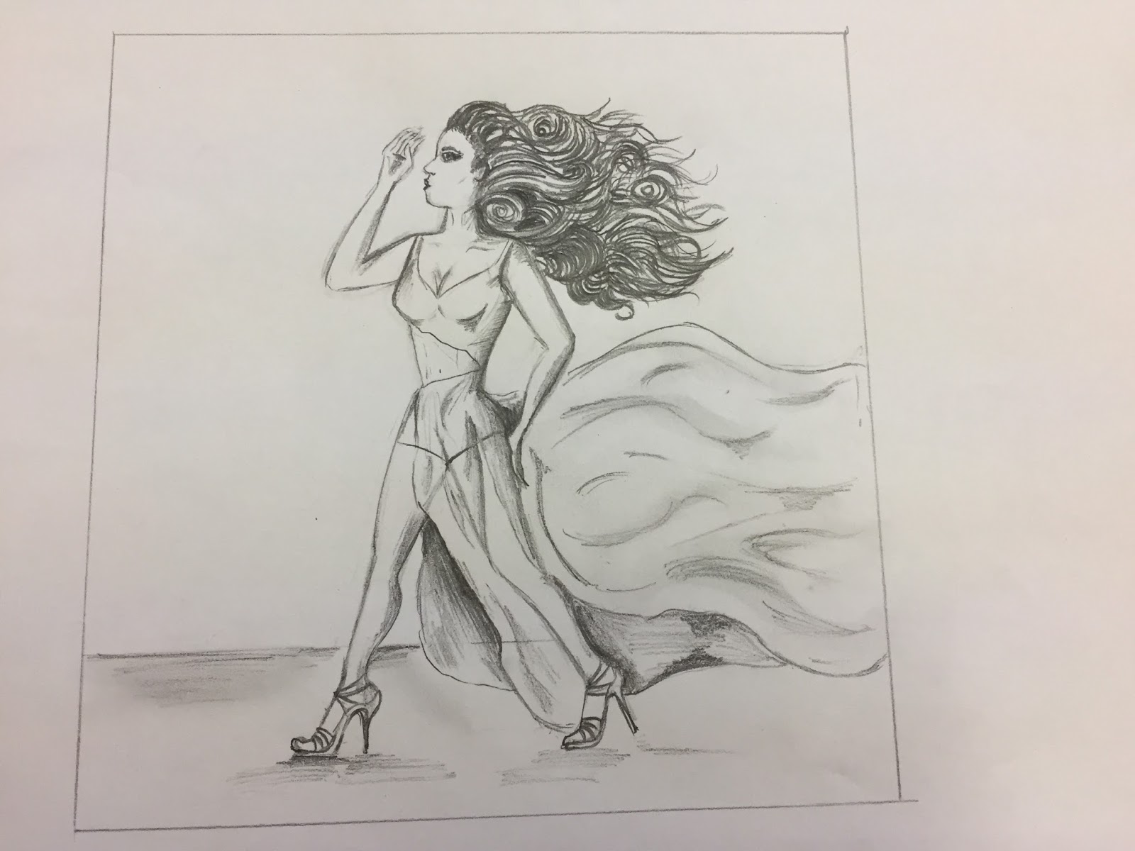
When we come to design our album artwork and
website, I don’t think we need to make any major changes. For our album
artwork, we might incorporate the element of the fan blowing her skirt, that we
didn’t manage to film for the video. We also might include the snake motif
around the website and album. This links in with the snake jewellery used in
the music video. We want there to be a link between the album, website and
music video, to create a cohesive campaign. On the other hand, we don’t want
all three products to be the same, because we want to show a different side to
the artist.
Furthermore, the website and digi-pack represent the entire album of the artist, not just the music video that we shot.
Furthermore, the website and digi-pack represent the entire album of the artist, not just the music video that we shot.
In conclusion, I feel that it was a successful
shoot day and that it was a learning and growing experience for our knowledge
in media. It also gave us an opportunity to work in a group and work with a
crew of people, which is a good skill to learn and have.