"The camera can capture my face, but until it captures my soul, you ain't got a movie"


Thursday 23 June 2016

Introduction to Photoshop


Photoshop is a digital software created by Adobe, the software allows to digitally edit images and even create illustrations. It is an extremely powerful design software that gives the option to use many tools in order to edit your image. Throughout the workshop I learned that Photoshop is not a program but a skill, it requires practice and knowledge of the software in order to use it well. At first I found it very difficult to edit images. However as I continued to use the software over the course of the week, I began to hone my skills and create more refined edited images. In addition, my ability and skill in using the tools offered became better as I practiced. I discovered many tools offered by the software, all of which had different functions and helped me to create my final product.

Example of Photoshop editing 


There are many tools available to use such as the, select, move, lasso, brushes and smudge tool.  The lasso tool enables you to select the areas you want in an image, by tracing or drawing around the area, this can then allow you to cut out the image and manipulate it (move it, rotate it, change scale). The lasso tool has three options; firstly, the ‘Lasso Tool’, this allows you to draw around the image you want, freehand, almost like using a real pen. Then there is the ‘Polygonal Lasso Tool’, to use this option you should ‘left-click’ to select a point and hold down the mouse button and select another point, until you have selected the area you want.  Lastly, the ‘Magnetic Lasso Tool’ helps to select areas with defined edges. You must ‘left-click’ at the starting point and then move the cursor along the edges and the tool automatically selects the object. 


The move tool enables you to move a selected area around after it has been placed. 


The select tool looks like a mouse cursor and allows you to highlight an area you want.  To change the size, rotate etc… you need to go to edit then select transform and then choose the option you want, such as scale (allows you to resize the image). I learnt while re-sizing my images that if you hold down the shift button, the image is proportional as you scale it, thus preventing it from become distorted.

In Photoshop all images are in layers, a layer is basically an image on top of another image. The images can be placed in front or behind another image, this is the purpose of layers. It is many images on top of each other that make one final image. Different tools such as the blend and opacity allow to make the different layers to appear as one seamless picture.
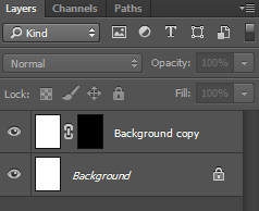
Layers in Photoshop

Before making anything on Photoshop, I would design a plan on paper, so that I could work on my idea and prevent from making mistakes when I design on Photoshop. It allows you too quickly alter and change your idea without wasting time editing on Photoshop. Especially, if you are pitching ideas, it is best to give a raw idea of what the final product will look like, and if it is not liked, you can change it without having wasted time and energy creating the concept on Photoshop.


Throughout the workshop I also learned some do’s and don’ts for Photoshop. Firstly, the do’s; you can make your canvas size larger than it needs to be so that you have room to make the design and then you can crop the canvas down to the appropriate size. 

Additionally when scaling images press the shift key so that they remain proportional. You should also label your layers so that they are easy to find and move around. When you select something make sure to mean every click, because it can be very easy to select something else, because of the huge number of options. Lastly do not over-edit images as that can make the subject lose pixels and details and appear artificial.


Saturday 18 June 2016

Music Video Analysis- Madonna 'Like a Prayer'


A music video is a media text that incorporates sound and film to advertise and promote the image and ideology of an artist. A music video is an essential aspect of a music campaign and raises awareness for the artist’s music; therefore helping to increase profits, the status and demand for the artist.

Madonna’s music video for her song ‘Like a Prayer’ is highly controversial. Firstly, she was breaking away from her dance-pop music and following a different ideology which featured matured and deeper lyrics. The music video is very provocative, discussing issues of race, sexual oppression and religion. The imagery used depicts racism, rape and sexual behaviour in church all of which, especially, at the time of release in 1989 were sensitive subjects that were rarely discussed. The controversial topics angered many religious organisations due to elements that broke moral and religious codes in the video.
 
 
Madonna is a world renowned artist and considered a star by Richard Dyer’s star theory. She is known for her provocative and Avant-guard style, this is a construction by the institution in order to distinguish her as an artist and to create as much profit for the institution.
 
Her music videos and songs construct her as being original, creative, rebellious and her tendency to push the limits of society and break away from the norm. Due to her innovative and experimental nature she is considered an icon in music and a major influence to many present artists which cements her as a ‘star’ in Dyer’s theory. Her status and recognition, has developed from the fact that her audience has accepted her ideology and appreciated her, which in turn has led to her success.

Keith Negus proposed a theory which stated that artists/bands are either organic or synthetic. Artists/bands who are organic, write their own music and are more natural in their image. On the other hand, synthetic artists/bands are constructed and unrealistic figures who are controlled and crafted by the industry. By this definition Madonna would be considered a synthetic artist because she has been constructed by her record company, in order to appeal to audiences. By looking at her music videos and album covers she is featured prominently in the forefront, this is to promote her image; and is an element/technique predominantly used by synthetic artists. Additionally her clothing style is flamboyant and exciting connoting that she is a fake persona, thus reinforcing her synthetic image.


The technological convention of using a long shot of Madonna as she dances in front of burning crosses, allows her to be fully shown and emphasises her provocative dancing and revealing clothing which clashes with the religious significance of the crosses, because it goes against the moral values of Christian beliefs.
 
 
Additionally the burning crosses are strong symbolic convention, because they connote to the KKK (Klu Klux Klan) a racist white supremacist group which were known for committing violent and horrible crimes against people of colour, especially black people. The burning cross was planted in front of the homes of black people which meant they were targets and would be killed. The burning crosses featured numerous times throughout the video are controversial because they are a sensitive subject and image for black people and are synonymous with hate crimes. By dancing in front of them it make look like Madonna is glorifying the KKK.
However when looking at the different elements in the video where she interacts with black people, the burning cross may serve as a reminder of the horror and injustice committed against black people.  
 
Another symbolic convention used is when she enters the church and the statue of Jesus is black. This would be controversial because in western societies Jesus has been represented as being white and to change him to black would almost be considered sacrilegious because again it breaks society’s expectation. I think Madonna was trying to say that Jesus was not white; he was Middle Eastern so he would have been darker than how he is presented in western societies. Thus making people aware, especially white supremacists that the religion they follow is based off a man who was a person of colour.

In another shot, Madonna is being kissed and most likely having sex with Jesus. This would have been extremely controversial as Jesus is considered a pure figure and the bible states that he was not married therefore to show Jesus having sex with Madonna would have been considered blasphemous because she is shaking the foundations of Christian morals and beliefs. The sexual relation between Jesus and Madonna also has a double meaning, he is black and she is white. She is in an interracial relationship which at that time (and now) was to some degree considered taboo. She is expressing that people of any colour can love each other.


The technical conventions of having a bright light on her face, makes her appear holy and pure, connoting that she is the Virgin Mary. Because she is taking the role of a religious figure this would be considered controversial because it would be blasphemous. T
his would also have some intertextuality with her previous 1984 hit ‘Like a Virgin’.


Madonna then goes on the pick up a knife the semiotics of the knife suggests that she is violent which juxtaposes the peaceful environment of the church, after picking the knife up she drops it and the shot reveals her hands to have stigmata. The element of stigmata connotes that she is Jesus which is another example of Madonna adopting the role of a holy figure which would be sacrilegious and controversial for Christians.

 
The symbolic conventions of her lyrics also are controversial she says “When you call my name it's like a little prayer/ I'm down on my knees, I wanna take you there”. The lyrics firstly suggest because she is in church that she is on her knees praying. However, the addition of “I wanna take you there” strongly suggests that she is engaging in a sexual act and wants to pleasure ‘Jesus’. This again refers to her having sex with Jesus and in a church which is blasphemous to Christian beliefs.
 
In conclusion, Madonna’s music video for ‘Like a Prayer’ can be considered the most controversial music video ever made. Due to the fact that it explicitly explores sex, race and religion, all of which are highly sensitive topics; more so when they are combined. Her provocative dancing and clothing combined with imagery of burning crosses and having sexual relations with a ‘black’ Jesus are and were extremely controversial when it was released. The video breaks society’s expectations of a music video and the norms. Her music video provokes the audience to talk more and discuss issues involving race, religion and sex and by being very visual she is trying to inspire a global discussion.
 
Madonna - 'Like a Prayer' video
 

Wednesday 15 June 2016

Album Artwork

An album artwork should represent the genre clearly, so it can be easily identifiable and attract its target audience; it should be visually striking and standout. It should also convey the band/artists ideology and construct the band/artists image as explained by Dyer's star theory. The artwork should also suggest whether the band/ artist is organic or synthetic as described by Negus's theory.

marlowe: 'it's turning me on' - debut EP 


Do you think this album belongs to a band or an artist?

By looking at the conventions used, I would say this album belongs to a band, because typically and artist would have their picture on the cover. Additionally, their is only one name of who the album belongs to and generally artists use their first and last name and if they use a single name it is usually in capital letters.


Is this band/artist being represented as organic or synthetic?
I would say that the band is being represented as organic, because a synthetic band or artist would have a picture of themselves on the cover to promote their image. The cover also is made to look vintage and worn out, suggesting the bands organic nature. 


What genre do think this album is and why?
I think that the genre is indie/rock, because of it's ambiguous, unconventional and slightly bohemian style.


What do like or dislike about the artwork? Why? 
I dislike it because it is all one colour (red) which I find uninteresting, and also the small case and small size of the title of the album is not visually striking. 


What questions would I ask the band/artist?

I would ask them why did they choose the all red cover? I would also ask who is the girl and what is the meaning behind her?

 
marlowe: 'darksparklecorner' - debut album 


Do you think this album belongs to a band or an artist?
I think it is a band because, of the single name and also the cover doesn't feature an artist or a band member.


Is this band/artist being represented as organic or synthetic?
The band is being represented as organic because of the ambiguity of the cover. Synthetic bands generally choose images that are pleasing and pretty to look at; however this band has used a photo of a child looking scared, which is quite disturbing. 


What genre do think this album is and why?

The symbolic conventions of the child looking scared I would say the band is indie/rock because the cover is unorthodox and unsettling. Additionally, I would say it was indie because the photo looks old and retro. 


What do like or dislike about the artwork? Why? 
I like the artwork because the lighting is bright (technical conventions) and the composition of the photograph is visually striking. It makes we want to find out why the child is scared.


What questions would I ask the band/artist?
I would ask the band why did they choose to have the title very small? Were they worried the genre may be difficult to understand?
I also would want to know who is the child and what is the meaning behind him?

 
marlowe: 'a day in july' - 2nd album 


Do you think this album belongs to a band or an artist?

I think that this album belongs to a band, because none of the artists or band members are on the cover, and perhaps the children are linked to the bands songs.


Is this band/artist being represented as organic or synthetic?

The cover suggest that the band is organic, firstly the setting shown involves nature and the photo itself has a grainy, vintage quality. Additionally, the band does not promote their image or themselves on the cover which is opposite to most synthetic bands.


What genre do think this album is and why?

I think that the genre is indie/folk because the cover is very ambiguous and symbolic and that fits in with the genre's vague and unconventional nature. Furthermore, the children are dressed in traditional cultural clothing which hints at the folk aspect of the album.


What do like or dislike about the artwork? Why? 

I dislike the album cover, because the picture itself is unclear and of bad quality. I also find that the burgundy red border against the picture is not a harmonious colour and is displeasing to look at.


What questions would I ask the band/artist?

I would want to ask the band why they use burgundy red throughout all their four albums?


Also what is the significance of the children in the picture?


marlowe: 'deep breath fake air' - 3rd album


Do you think this album belongs to a band or an artist?

I think that this album belongs to a band, because none of the artists or band members are on the cover.


Is this band/artist being represented as organic or synthetic?

The band is organic because the band does not promote their image or themselves on the cover which is opposite to most synthetic bands. This shows them as more down to earth and ordinary.


What genre do think this album is and why?

I think that the genre is indie/rock because the cover is ambiguous and the illustration of the man's anatomy is unusual for a cover; therefore it fits in with the genre's bohemian style.


What do like or dislike about the artwork? Why? 

I like the cover because the colours are very vibrant and stand out. The illustration is clear and simple and easy to understand and the black bold font makes the band name very easy to read and notice, compared to their other covers.

What questions would I ask the band/artist?

I would want to know why they chose a human anatomy for their cover? And what does the title mean ('deep breath fake air')? 


TESTCARD: 'Lines' - debut album


 Do you think this album belongs to a band or an artist?

I believe that the album belongs to a band, because there is no specific image of a person on the cover which could suggest it is an artist. Therefore I would conclude that this album belongs to a band.

Is this band/artist being represented as organic or synthetic?

I think that this band is organic because the album cover and design suggests their natural and unconstructed image. The band does not advertise themselves on the cover, thus appearing more natural.


 What genre do think this album is and why?


I feel that the genre is a form of indie-electronic music. The subdues colours and artwork suggest an indie style. Additionally, the picture in the middle looks like a timeline on a computer and connotes a digital and electronic look.

What do like or dislike about the artwork? Why? 

I don't like the cover because the colour scheme and design are not interesting. In addition, it does not stand out.


What questions would I ask the band/artist?

I would ask them what the image means? Why they chose to have the cover all grey?

ROJA: 'Promises I should have kept' - debut album 


 Do you think this album belongs to a band or an artist?

I think that this album belongs to a band because the name is 'Roja' an offshoot of the word 'red' in Spanish; and most artists use both their names or first name on the cover, whilst bands tend to use the name of inanimate objects.

Is this band/artist being represented as organic or synthetic?

The band appears to be organic because the illustration has an old/vintage quality to it and depicts a situation that involves nature. This suggests that the band is natural and slightly quirky due to their choice in design. 

 What genre do think this album is and why?

I think that the genre is latino/folk music, because the lady on the horse appears to be wearing a traditional, cultural dress, which hints at the folk aspect. Furthermore, the name of the band 'Roja' suggest a latin influence in their music.

What do like or dislike about the artwork? Why? 

I like the album artwork because of the detailed illustration, is very captivating and striking. The black, white and red colour scheme stands out and is very complimentary. 

What questions would I ask the band/artist?

I would ask them why the album cover is called 'Promises I should have kept'? Lastly, why did they choose the name 'Roja'?


Saturday 11 June 2016

Wix Home Page: Mariah Carey

VS


Using Wix (a site that allows you to create your own website) I created a promotional website for the artist Mariah Carey. I created a homepage of a website without looking at the artists actual website in order to give a fair comparison between the two websites in my analysis. The homepage I created contains photos, albums and tour information for Mariah Carey. In this post I will look at the differences and similarities between the two homepages of Mariah Carey.

Below is a link and screenshots of my homepage


  • What does your website and the original website have in common?


Some similarities is that both sites use gold, beige, white and purple colour scheme. I chose these colours because Mariah Carey usually presents herself very elegantly and extravagant, I thought that gold and whites could convey that. Additionally, after doing research I discovered that Mariah's favourite animal and logo is a butterfly. Using the connotations of a butterfly being stereotypically feminine, I chose stereotypical feminine colours such as the pinks and purples.

Below is my website which shows a picture of Mariah in front of a gold ocean; this is similar to the background of the original website which is a gold ocean.


This is a screenshot of the original homepage. The beige/gold background is very similar to my home page below which has a beige/gold background. Both homepages have an element of the pink and purple.


Both homepages have videos that promote Mariah Carey. On my site it a music video of her latest single, whilst on her site it is an interview.

(My website above, original below)

On my homepage, I used one of Mariah Carey's concert posters to advertise ticket sales for her new Vegas show.  This is similar to the original website.

On the original website their is some information of her Vegas concert and the ability to purchase tickets for her show. The difference is that on the original homepage the tickets available are displayed as if they are running out (e.g. "There's still time to secure a special ticket"). This emphasises her demand and popularity and persuades her fans to purchase tickets. 


Both websites also market her merchandise specifically her perfume collection.


This is the photo I used on my website


This is the one used on the original site to promote the perfume.


  • Do you have the same title font? Layout? Picture design?

I would consider the title font to be very similar between the two sites. They both are a classical font style. (Original website first and my website second).

Again, I chose a classic font because Mariah Carey is know for being refined and sophisticated. Both fonts present Mariah Carey as a classic diva, which is her trademark persona. However, I did use a photo of her name on the tag line at the bottom of the homepage which is almost identical to the one used on her site.


The album cover photo is the same on both sites. The album is her latest '#1 to Infinity' which would be being promoted on her site, that is why I chose it.
(My Website)

(Original Website)


I also placed a donation button with a photo of Mariah Carey hugging children which is the same photo used on her site.
The photo shows Mariah Carey's philanthropic side, which helps promote her and create a positive star image.


  • What is different between your website and the original website (be specific)? Why is this? 
On my homepage I used a large close-up shot of Mariah Carey, as the background. I did this because Mariah Carey has a well known 'Diva' public persona. Additionally, she is one the biggest selling artists of all time, therefore I chose to portray her as grand on the homepage. Whilst on the homepage the background is a light beige colour, and her face is not the background. Compared to Mariah Carey's official website, my homepage looks less refined than hers. This is because her website has been designed by professionals and has been paid for therefore allowing for higher standards of aesthetics.

( My Website)
(Official Website)
Another difference is that on my homepage her name is in the centre at the top and the rest of the information is below her in small boxes. On the official website, the title is the album cover of her latest album, and the title is replaced with '#1's'. This promotes her album but also emphasises her musical status and fame with '#1' right next to her, connoting that she is No.1.

  • Is the genre obvious in both?
I think that the genre is obvious in both. On my website the bold colours such as the pinks and purples, hint that she is a pop singer, however they are darker and warmer tones which connote at her R&B and Soul music styles. The classic font and elegant structure of the website suggests that she is a mature singer and a classic artist. Similarly, on her website the colour scheme is very similar to my homepage. However, the original homepage is much more sleeker and modern, perhaps suggesting that she is embracing a new style of music and adapting her '90's' R&B and ballad style to a more contemporary audience.
  • Do you represent the start image? Explain?
My home-page showcases Mariah Carey as a musical icon. For example, on my website her face is the background suggesting her status and recognition of being very high. Additionally, the colours used connote luxury such as the gold and royal purple.
At the bottom their is a tag line with her name and signature.
    Richard Dyer’s star theory states that for an artist to be successful they need to be original, creative and talented. It also states that; “the star must be simultaneously present and absent for the consumer". I think that my website follows this; because the homepage has her as a strong presence and her name, images and videos are prominent throughout, however she is not physically present with her fans.
    Dyer also said that “the star must be simultaneously ordinary and extraordinary for the consumer”. Her icon and celebrity status already makes her extraordinary but on the homepage I have photos of her helping charities and dressed ordinarily.

    This is contrasted with a photo of her in a dress holding an award with the headline "Mariah wins People's Choice Award".
    This presents her as being acclaimed and extraordinary.


    In conclusion, both websites successfully promote and market her star image, concert dates and merchandise.

    They both are constructed to convey her 'Diva' personality, which her fans like her for.