I will be looking at visual elements and themes that match my artist’s star image and genre. Additionally, finding visual elements that are cohesive and link the music video, digipak and website homepage. I want all three aspects of the campaign to express the artists image and the meaning of the song.
For the album artwork for my first idea, ‘Honey’ by Mariah Carey, I wanted to incorporate the theme of honey from the music video. To give some initial ideas I thought about the golden colour of honey, I then went online to Adobe Colour Wheel. On Adobe Colour Wheel I experimented with the gold colour on the wheel to find harmonious shades of gold that can be used on the album cover as a colour palette. Below you can see the shades of yellow and orange that I would like to use on the cover.
I also experimented with complimentary colours and found that powder blues, and dark blues compliment the gold and yellow tones. This gave me an idea of other colours I could use alongside the gold, that would make the image striking but still compliment the other colours. Below you can see the complimentary colour palette of golds and blues.
By looking at the genre and the star image of my artist, I would say that she is a synthetic artist. Therefore I would like the singer to be on the album cover. I wanted to incorporate the glamorous looks in the video and the gold palette, and have her pose for the album cover. I found these images below which I really liked for an album cover, the elements are simplistic, however the gold colour and sharp poses, make it a very striking digipak.
The costumes / jewellery and colour palette, made me think about cleopatra and I began looking at photos of cleopatra, and found some old poster artwork for the 1963 film ‘Cleopatra’.
I really liked the stylistic elements and then decided that the theme of the cover would be a modern-day cleopatra. I found some photos, that were the closest to what I would like on the cover. I want to present my artist as a modern day queen, and perhaps incorporating honey elements in the cover.
For the title and font, I was thinking of having the writing made by honey, like in the image below. I like the imperfect and organic style that the honey gives the writing.
I experimented with an amateur version of Photoshop and made a mock digipak in 10 minutes. This is not final or what I intend to do, but it allowed me to see how the composition of my ideas would look like
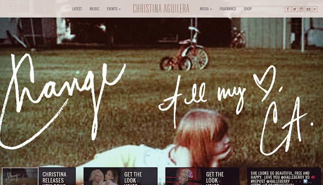
For the homepage I wanted to have a simplistic design with little writing, and with mostly the picture of the album or music video changing on the website. In the websites below, we can see the artists image is the main focus, with other information discreetly placed on the homepage.
Prince Website
Toni Braxton Website
Christina Aguilera Website
I want all the tabs and information on bars at the top of the website like in the Christina Aguilera website. I want to keep the website sleek and simple, with a lot of focus on the artist and their album.
Below is a collection of images I collected that inspire the artwork and design of my homepage. I would like a picture of the artist with half their face covered in honey, like in the image below.
In addition, because wax is made from honey wax, I thought of incorporating wax art into the visual elements of the homepage (like batik, which involves drawing patters with candle wax and then staining the material, to reveal the pattern). Below is a beautiful pattern made using wax (batik), the pattern could also be incorporated into the tabs and buttons of the website.


No comments:
Post a Comment