"The camera can capture my face, but until it captures my soul, you ain't got a movie"


Friday, 29 July 2016

Developing Idea for Digipak and Homepage for Idea 2 ‘Are You That Somebody?’

I will be looking at visual elements and themes that match my artist’s star image and genre. Additionally, finding visual elements that are cohesive and link the music video, digipak and website homepage. I want all three aspects of the campaign to express the artists image and the meaning of the song. 


For my second idea ‘Are You That Somebody?’ by Aaliyah, I began thinking about different ways to approach the album cover artwork. I began looking at the artist that are similar to mine, and I started looking at Rihanna’s album covers. 


I found an image from the cover art of her album ‘Loud'. 

This image reminded me of the famous painting ‘Christina’s World’ by American painter Andrew Wyeth (below). 

This led me to think about paintings; so I decided to find a painting from an artist, and use that as an inspiration for my work. I thought of Caravaggio, in most of his painting the figures are lit dramatically from the side, and are pasted against an obscure, black background; the darkness accentuates the grotesque nature of the scene.  Caravaggio uses harmonious monotone colours; his use of smooth strokes for the shadows and folds of the clothes, contrast the angularity of the facial expressions. 

This reflected the style of the song and music video, because my artist is shown as mysterious, dark and manipulative. I started looking at his paintings and found that his ‘Medusa’ painting was very striking; additionally the stylistic element of the snake connotes that the artist is sly, manipulative and dangerous. 

From there I searched online for photos of women with snakes. Below I found some photos that are very similar to what I would like on the cover of the album.
  
I like the close up shots of her face, where the snake is really close like the one on her lips. However, because she is a synthetic artist, I think that she should be featured on the album artwork. Therefore, the cover could include her face, with the snake around her arm like this one.


Then on the rest of the digipak (on the other sides) their could be the close up shots of her body with snake like these ones. 


This could balance her role as a synthetic artist but maintain the mysterious and dark tone of the album. 


For the homepage, I decided to keep it clean and sharp, because my artist, has a ‘bad girl’ / rebel star image; and I want to reflect that in the sharp, clean and sleek design of the homepage. Due to the snake element in the music video and on the cover, I thoughts about the jewellery company ‘BVLGARI’ who are known for their snake inspired jewellery. 


I looked at images for their website and found some home-pages which I really liked. The ones I selected had a dark mysterious nature to them, and the design was very sleek, which is what I was looking for. 


I would want my homepage to include a photo of the artist with elements from the cover and music video (like the snake).

Another website I really liked was Rihanna’s website, I really like that the tabs and buttons ran along the side of the website, which is different, emphasising the ‘rebellious’ attitude of my artist’s image. I also like how the images where cut diagonally at the bottom before the content.


Overall, I would like to incorporate the sleek lines/cuts and design used on Rihanna’s website with the dark tones and dramatic photography and style on the ‘BVLGARI’ website. 


Thursday, 28 July 2016

Developing Idea for Digipak and Homepage for Idea 1 'Honey'

I will be looking at visual elements and themes that match my artist’s star image and genre. Additionally, finding visual elements that are cohesive and link the music video, digipak and website homepage. I want all three aspects of the campaign to express the artists image and the meaning of the song. 

For the album artwork for my first idea, ‘Honey’ by Mariah Carey, I wanted to incorporate the theme of honey from the music video. To give some initial ideas I thought about the golden colour of honey, I then went online to Adobe Colour Wheel. On Adobe Colour Wheel I experimented with the gold colour on the wheel to find harmonious shades of gold that can be used on the album cover as a colour palette. Below you can see the shades of yellow and orange that I would like to use on the cover. 

I also experimented with complimentary colours and found that powder blues, and dark blues compliment the gold and yellow tones. This gave me an idea of other colours I could use alongside the gold, that would make the image striking but still compliment the other colours. Below you can see the complimentary colour palette of golds and blues.

By looking at the genre and the star image of my artist, I would say that she is a synthetic artist. Therefore I would like the singer to be on the album cover. I wanted to incorporate the glamorous looks in the video and the gold palette, and have her pose for the album cover. I found these images below which I really liked for an album cover, the elements are simplistic, however the gold colour and sharp poses, make it a very striking digipak. 

The costumes / jewellery and colour palette, made me think about cleopatra and I began looking at photos of cleopatra, and found some old poster artwork for the 1963 film ‘Cleopatra’.

I really liked the stylistic elements and then decided that the theme of the cover would be a modern-day cleopatra. I found some photos, that were the closest to what I would like on the cover. I want to present my artist as a modern day queen, and perhaps incorporating honey elements in the cover. 


For the title and font, I was thinking of having the writing made by honey, like in the image below. I like the imperfect and organic style that the honey gives the writing.

I experimented with an amateur version of Photoshop and made a mock digipak in 10 minutes. This is not final or what I intend to do, but it allowed me to see how the composition of my ideas would look like 

For the homepage I wanted to have a simplistic design with little writing, and with mostly the picture of the album or music video changing on the website. In the websites below, we can see the artists image is the main focus, with other information discreetly placed on the homepage. 

                                         Prince Website

Toni Braxton Website

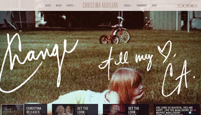
Christina Aguilera Website

I want all the tabs and information on bars at the top of the website like in the Christina Aguilera website. I want to keep the website sleek and simple, with a lot of focus on the artist and their album. 


Below is a collection of images I collected that inspire the artwork and design of my homepage. I would like a picture of the artist with half their face covered in honey, like in the image below. 


In addition, because wax is made from honey wax, I thought of incorporating wax art into the visual elements of the homepage (like batik, which involves drawing patters with candle wax and then staining the material, to reveal the pattern). Below is a beautiful pattern made using wax (batik), the pattern could also be incorporated into the tabs and buttons of the website. 


Wednesday, 27 July 2016

Idea 3 for Music Video 'He Wasn't Man Enough'


The track I’m choosing for my third music video idea is ‘He Wasn’t Man Enough’ by Toni Braxton. I chose this song because of it’s fusion of R&B and pop and also the lyrics offer a good story (narrative) to base the music video on. 

My artist is a R&B artist who is strong and empowered, she is known for diva star image. She also can do either slow and more soft R&B music and up-tempo R&B. She is a diverse artist who can either do emotional ballads and R&B/Pop music. In order to find similar artist like my artist I looked at artists that did both emotional ballads and up-beat songs. I chose Whitney Houston, who is known for her emotional ballads (such as ‘I Will Always Love You’) and for her upbeat R&B/Pop music (such as ‘I Wanna Dance with Somebody).

For the setting of the music video, I thought that it should take place in a country club (or a hotel/mansion), a location that looks like an expensive exclusive hotel. The music video, will be shot in various locations in the ‘hotel’ , this includes: a restaurant (in the hotel); a VIP suite (a white room with decadent furniture and materials, such as furs, etc…); A gentlemen’s cigar room (a warm, wooden library / ‘smoke room’); an oriental inspired bar (a club or bar that has Japanese design (for example, a sushi bar, etc….) and lastly a pool (a landscaped outdoor area, with fountains and pools).


At some points throughout the video I want there to be a choreographed dance sequence involving the singer and sometimes just the dancers. After researching online I found a clip of two dancers dancing to the track. I really liked their choreography because it was expressive but not to erratic or busy. Below is an attached clip of the choreography I would like to incorporate into the music video.


The narrative of the music video basically shows the singer to be living an extravagant and glamorous life, after she broke up with her ex boyfriend. It shows her living a good life and doing well for herself after their breakup. In the music video we see her dressed lavishly. There are also some scenes, like in the restaurant where she is dining with another man and her ex is watching at her from another table, with his new girlfriend sitting next to him. We can see that the new girlfriend of the ex does not like the singer because she is jealous; to which the singer replies in the first verse “Don’t you know that he was my man? / But I chose to let him go / So why do you act like I still care about him?”. 


The music begins and it to starts with the singer walking into a dinning room (in the hotel), the windows are open and the wind is blowing the white curtains. 


The restaurant is full with people, and many people glance at her (because she is famous and glamorous), as she walks through the restaurant, this is the first moment we see her ex gazing at her because he is shocked to see her. She walks through a hallway and past a reception area and  then enters it into an elevator. During this period I want close ups of her shoes (high heels) close ups of her body, but no camera shots of her face until she begins singing. 

This is a photo of my sketch, this is how I imagined her walking in


During the intro she is wearing a white one piece bathing suit, with some cut out openings on the bathing suit; she is also wearing white high heels; a large white sun hat and a white semi-transparent scarf she has on her arm. The only thing different are her large framed black glasses.


After she gets into the elevator and steps out of it, it cuts to her in a large white room, with fur carpets and over-the-top furniture and materials (it is very decadent),


She is in bed singing and also sings while stretched on a white chaise-lounge chair. 


When she is on the bed she is just wrapped in fur blankets and fur scarves.

She also wears a white fur jacket when she is on the chair. 


The rest of the music video is just shots of her in different outfits in different locations, and the scenes just cut into each other, changing from shot to shot.

In one scene, she is in a ‘gentlemen’s cigar room’, she sings whilst siting on a  leather sofa, she also smokes and holds a cigar in the scene. 


In this scene she wears a black leather skirt with a black leather jacket, with bullet casings adorned on the jacket (a slightly military inspired outfit).  


The next scene is her in an opium style den room, the atmosphere is slightly smokey and this is also when we see her and the back-up dancers perform the choreography. 


She wears a blue sequin jumpsuit, with a hoodie in this scene. 

Below I sketched my idea of what I would like her to wear


In this scene her outfits changes between the blue sequin jumpsuit and a gold fringe dress. 


In the next scene the doors of the dinning room open and she walks in wearing a flowing red gown, she is seated at her table and is on a date.
This makes both her ex and her ex’s girlfriend evidently jealous. The singer exchanges a few glances with her ex’s new girlfriend. 

To taunt her even more, the singer stands up rips the bottom of her dress, to make it into a short red dress.

She then gets onto the table and continuous the choreographed dance; the other back up dancers get on top of other tables and join her in the dance. 

In the last location she is beside a pool lying on a sun bed. 


I want to have shots of the outdoor pool area and landscape. 

Additionally, I would like shots of the singer in front of the pool with the back-up dancers.

She continues singing. Here she wears a turquoise sun dress and a silver neckless. 

Throughout the song her outfits and locations change from one to the other. It finishes with her by the pool, lounging with the back up dancers, she puts on her glasses, when she says the last line “He wasn’t man enough for me”, the song then ends and cuts to black.


Stylistic elements I would include would be the choreographed dance moves, which highlight the fact that she is a powerful woman, who is independent and does not need a man, which conveys the message of the video. She also is seen dressed in leather and with a jacket covered in bullets, whilst in a ‘gentlemen’s cigar room’ smoking a cigar; this is subversive because it shows her in an environment, generally associated with men, which emphasises her strong nature. 


The video fits with the track because it does show the tension between the singer and the ex’s new girlfriend, which is mirrored off the lyrics : “ Stop blamin' me / He wasn't man enough for me /  If you don't know now here's your chance / I've already had your man”. The song is about how she is moved on and doesn’t care for him, and by showing her life as fun and happy, it emphasises the fact that she is moved on.  Her avant-guard style (glamorous clothing) and expensive taste suggests that she is enjoying life and is successful after she broke up with the man. 


The video fits with the star image of the artist because it shows her as being in control and in power and also the outfit and location changes express her ‘Diva’ image.