
VS

Using Wix (a site that allows you to create your own website) I created a promotional website for the artist Mariah Carey. I created a homepage of a website without looking at the artists actual website in order to give a fair comparison between the two websites in my analysis. The homepage I created contains photos, albums and tour information for Mariah Carey. In this post I will look at the differences and similarities between the two homepages of Mariah Carey.
Below is a link and screenshots of my homepage


- What does your website and the original website have in common?
Some similarities is that both sites use gold, beige, white and purple colour scheme. I chose these colours because Mariah Carey usually presents herself very elegantly and extravagant, I thought that gold and whites could convey that. Additionally, after doing research I discovered that Mariah's favourite animal and logo is a butterfly. Using the connotations of a butterfly being stereotypically feminine, I chose stereotypical feminine colours such as the pinks and purples.
Below is my website which shows a picture of Mariah in front of a gold ocean; this is similar to the background of the original website which is a gold ocean.


 This is a screenshot of the original homepage. The beige/gold background is very similar to my home page below which has a beige/gold background. Both homepages have an element of the pink and purple.
Both homepages have videos that promote Mariah Carey. On my site it a music video of her latest single, whilst on her site it is an interview.
 (My website above, original below)
On my homepage, I used one of Mariah Carey's concert posters to advertise ticket sales for her new Vegas show. This is similar to the original website.

On the original website their is some information of her Vegas concert and the ability to purchase tickets for her show. The difference is that on the original homepage the tickets available are displayed as if they are running out (e.g. "There's still time to secure a special ticket"). This emphasises her demand and popularity and persuades her fans to purchase tickets.

On the original website their is some information of her Vegas concert and the ability to purchase tickets for her show. The difference is that on the original homepage the tickets available are displayed as if they are running out (e.g. "There's still time to secure a special ticket"). This emphasises her demand and popularity and persuades her fans to purchase tickets.
Both websites also market her merchandise specifically her perfume collection.

This is the photo I used on my website

This is the one used on the original site to promote the perfume.
- Do you have the same title font? Layout? Picture design?
I would consider the title font to be very similar between the two sites. They both are a classical font style. (Original website first and my website second).

Again, I chose a classic font because Mariah Carey is know for being refined and sophisticated. Both fonts present Mariah Carey as a classic diva, which is her trademark persona. However, I did use a photo of her name on the tag line at the bottom of the homepage which is almost identical to the one used on her site.

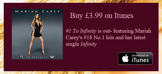
The album cover photo is the same on both sites. The album is her latest '#1 to Infinity' which would be being promoted on her site, that is why I chose it.
(My Website)
(Original Website)

I also placed a donation button with a photo of Mariah Carey hugging children which is the same photo used on her site.
The photo shows Mariah Carey's philanthropic side, which helps promote her and create a positive star image.


- What is different between your website and the original website (be specific)? Why is this?
On my homepage I used a large close-up shot of Mariah Carey, as the background. I did this because Mariah Carey has a well known 'Diva' public persona. Additionally, she is one the biggest selling artists of all time, therefore I chose to portray her as grand on the homepage. Whilst on the homepage the background is a light beige colour, and her face is not the background. Compared to Mariah Carey's official website, my homepage looks less refined than hers. This is because her website has been designed by professionals and has been paid for therefore allowing for higher standards of aesthetics.

( My Website)
(Official Website)
Another difference is that on my homepage her name is in the centre at the top and the rest of the information is below her in small boxes. On the official website, the title is the album cover of her latest album, and the title is replaced with '#1's'. This promotes her album but also emphasises her musical status and fame with '#1' right next to her, connoting that she is No.1.
- Is the genre obvious in both?
I think that the genre is obvious in both. On my website the bold colours such as the pinks and purples, hint that she is a pop singer, however they are darker and warmer tones which connote at her R&B and Soul music styles. The classic font and elegant structure of the website suggests that she is a mature singer and a classic artist. Similarly, on her website the colour scheme is very similar to my homepage. However, the original homepage is much more sleeker and modern, perhaps suggesting that she is embracing a new style of music and adapting her '90's' R&B and ballad style to a more contemporary audience.
- Do you represent the start image? Explain?
My home-page showcases Mariah Carey as a musical icon. For example, on my website her face is the background suggesting her status and recognition of being very high. Additionally, the colours used connote luxury such as the gold and royal purple.
At the bottom their is a tag line with her name and signature.
-
Richard Dyer’s star theory states that for an artist to be successful they need to be original, creative and talented. It also states that; “the star must be simultaneously present and absent for the consumer". I think that my website follows this; because the homepage has her as a strong presence and her name, images and videos are prominent throughout, however she is not physically present with her fans.
- Dyer also said that “the star must be simultaneously ordinary and extraordinary for the consumer”. Her icon and celebrity status already makes her extraordinary but on the homepage I have photos of her helping charities and dressed ordinarily.

This is contrasted with a photo of her in a dress holding an award with the headline "Mariah wins People's Choice Award".
This presents her as being acclaimed and extraordinary.

In conclusion, both websites successfully promote and market her star image, concert dates and merchandise.
They both are constructed to convey her 'Diva' personality, which her fans like her for.

No comments:
Post a Comment