A music campaign is an album, a website and a music video
that come together and are released to promote an artist or band. I’ll be
looking at the group ‘Boyz II Men’ and their latest music video (Losing Sleep), album cover ( for the album 'Collide') and
their website which promotes them.
Boyz II Men are an R&B vocal group, the
group tries to combine R&B with classic Motown
soul; they are renowned for their ballads and A capella harmonies.
When Boyz II
Men were at their peak in the 1990’s, their target audience was generally young
adults and teenagers; appealing more to women because of their songs emotional
and romantic nature, additionally women would be more interested in their music
because they are usually attracted to the male singers. Boyz II Men are a black
male group, they use this as a unique selling point, compared to other boy
groups at the time who were white, such as Backstreet Boys and NSYNC.


The
website, the album cover and the music video all showcase the band together;
the trio are all shown together in a line, this links all the products and also
emphasises the bands unity.
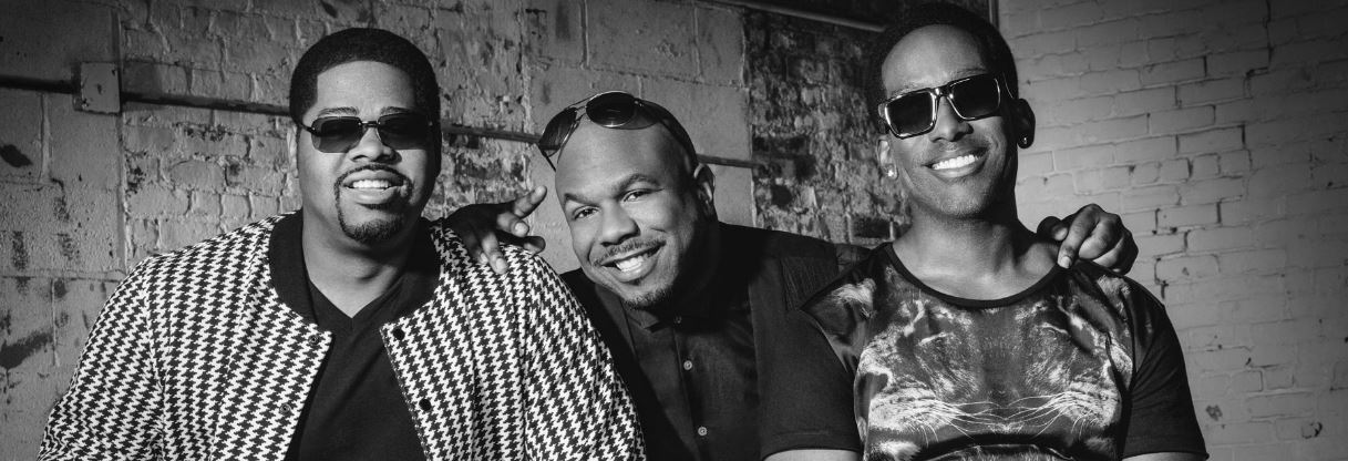
(Website Picture)

(Album Cover)

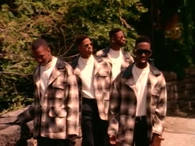
(Music Video)
There are also similarities across all three
products, the band member Nathan Morris wears sunglasses on the album cover,
the website photo and in the music video, this cements the singers look and
identity within the group.


Additionally, all three members at some point stand
as the lead (in front of the other members), this shows that all members are
equal.


Dyer’s star theory states that for an artist to be successful they need to
be original, young, creative and talented. It also states that; “the star must be simultaneously present
and absent for the consumer" and “the
star must be simultaneously ordinary and extraordinary for the consumer”. Boyz II Men follow the principles of Dyer’s
star theory. For example, they behave and look like ordinary and relatable
figures but their fame, accolades and status, make them extraordinary.

When the
group formed they were young, extremely talented and original in their music
and style; this fit with the Dyer’s star theory criteria.
Keith Negus suggested
that stars are either organic or synthetic. Artists who are organic, write
their own music and are more natural in their image. On the other hand, synthetic
artists are constructed and unrealistic figures who are controlled and crafted
by the industry. From Negus’s definition because their music videos and photos
look staged and fabricated rather than natural artist, 'Boyz II Men' are a synthetic group. The group has also been
under contract with big music companies such as Motown and Universal Music; In
addition, big recording companies will generally construct synthetic artists as
they are more easily marketable and profitable than organic ones.
There are differences across the three
products (website, music video and album cover). Firstly, the website is mainly
in black & white and the three singers are presented as being happy,
welcoming and approachable.

However, in their music videos there are bursts of
green, red and a heavy use of a blue filter and lighting; their facial
expressions are also more sombre and emotional.


(We see more sad facial expressions and various colours used; such as the blue, green, yellow and red)
The difference in colours from
their website and music video may also be because the band want to show
different sides to their characters, thus enticing their fans by adding depth
to their characters. Additionally, their contrast in facial expressions, having
approachable expressions on their website photo allow fans to relate and feel
closer to them whilst their distant and emotional expressions in their music
video give a more mysterious and ambiguous nature to their character.
(Website)

(Music Video)
This
follows the Dyer’s star theory that a star should be, “simultaneously present
and absent for the consumer “.
On the album cover, their faces are looking outwards, and their skin appears to be tattooed and melting away.
On the album cover, their faces are looking outwards, and their skin appears to be tattooed and melting away.


This is a
much more dramatic style for them as they are usually known for being simple
and less over the top. The reason the album cover may be dramatic and intense
in imagery, is because their label may be reshaping their image in order to
still please their older fans but also appeal to a younger generation of
listeners; therefore their album cover is intended to be visually striking and
have a shock value.
In conclusion, I think the campaign was successful in
showcasing the groups comeback and also showing their evolution and different
facades across the three products. However, it was not one of their best
reviewed albums; Andy Kellman of AllMusic said, "This is easily the
group's most scattered album, as it offers various shades of ballads, some
throwbacks, oddly escapist adult alternative fare, and even anthemic rockers.”
The album received a 2 and a half star rating on Allmusic and reached 37 on the
Billboard charts. From looking at the statistics and reception I would say it
was not financially successful; but it was artistically successful in evolving
the groups image and transforming them from ‘Boyz’ to ‘Men’.

No comments:
Post a Comment