marlowe: 'it's turning me on' - debut EP
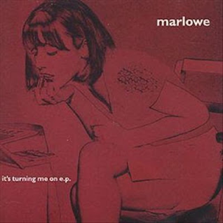
Do you think this album belongs to a band or an artist?
By looking at the conventions used, I would say this album belongs to a band, because typically and artist would have their picture on the cover. Additionally, their is only one name of who the album belongs to and generally artists use their first and last name and if they use a single name it is usually in capital letters.
Is this band/artist being represented as organic or synthetic?
I would say that the band is being represented as organic, because a synthetic band or artist would have a picture of themselves on the cover to promote their image. The cover also is made to look vintage and worn out, suggesting the bands organic nature.
What genre do think this album is and why?
I think that the genre is indie/rock, because of it's ambiguous, unconventional and slightly bohemian style.
What do like or dislike about the artwork? Why?
I dislike it because it is all one colour (red) which I find uninteresting, and also the small case and small size of the title of the album is not visually striking.
What questions would I ask the band/artist?
I would ask them why did they choose the all red cover? I would also ask who is the girl and what is the meaning behind her?
marlowe: 'darksparklecorner' - debut album

Do you think this album belongs to a band or an artist?
I think it is a band because, of the single name and also the cover doesn't feature an artist or a band member.
Is this band/artist being represented as organic or synthetic?
The band is being represented as organic because of the ambiguity of the cover. Synthetic bands generally choose images that are pleasing and pretty to look at; however this band has used a photo of a child looking scared, which is quite disturbing.
What genre do think this album is and why?
The symbolic conventions of the child looking scared I would say the band is indie/rock because the cover is unorthodox and unsettling. Additionally, I would say it was indie because the photo looks old and retro.
What do like or dislike about the artwork? Why?
I like the artwork because the lighting is bright (technical conventions) and the composition of the photograph is visually striking. It makes we want to find out why the child is scared.
What questions would I ask the band/artist?
I would ask the band why did they choose to have the title very small? Were they worried the genre may be difficult to understand?
I also would want to know who is the child and what is the meaning behind him?
marlowe: 'a day in july' - 2nd album

Do you think this album belongs to a band or an artist?
I think that this album belongs to a band, because none of the artists or band members are on the cover, and perhaps the children are linked to the bands songs.
Is this band/artist being represented as organic or synthetic?
The cover suggest that the band is organic, firstly the setting shown involves nature and the photo itself has a grainy, vintage quality. Additionally, the band does not promote their image or themselves on the cover which is opposite to most synthetic bands.
What genre do think this album is and why?
I think that the genre is indie/folk because the cover is very ambiguous and symbolic and that fits in with the genre's vague and unconventional nature. Furthermore, the children are dressed in traditional cultural clothing which hints at the folk aspect of the album.
What do like or dislike about the artwork? Why?
I dislike the album cover, because the picture itself is unclear and of bad quality. I also find that the burgundy red border against the picture is not a harmonious colour and is displeasing to look at.
What questions would I ask the band/artist?
I would want to ask the band why they use burgundy red throughout all their four albums?


Also what is the significance of the children in the picture?
marlowe: 'deep breath fake air' - 3rd album

Do you think this album belongs to a band or an artist?
I think that this album belongs to a band, because none of the artists or band members are on the cover.
The band is organic because the band does not promote their image or themselves on the cover which is opposite to most synthetic bands. This shows them as more down to earth and ordinary.
I think that the genre is indie/rock because the cover is ambiguous and the illustration of the man's anatomy is unusual for a cover; therefore it fits in with the genre's bohemian style.
What do like or dislike about the artwork? Why?
I like the cover because the colours are very vibrant and stand out. The illustration is clear and simple and easy to understand and the black bold font makes the band name very easy to read and notice, compared to their other covers.
Is this band/artist being represented as organic or synthetic?
The band is organic because the band does not promote their image or themselves on the cover which is opposite to most synthetic bands. This shows them as more down to earth and ordinary.
What genre do think this album is and why?
I think that the genre is indie/rock because the cover is ambiguous and the illustration of the man's anatomy is unusual for a cover; therefore it fits in with the genre's bohemian style.
What do like or dislike about the artwork? Why?
I like the cover because the colours are very vibrant and stand out. The illustration is clear and simple and easy to understand and the black bold font makes the band name very easy to read and notice, compared to their other covers.
What questions would I ask the band/artist?
I would want to know why they chose a human anatomy for their cover? And what does the title mean ('deep breath fake air')?
TESTCARD: 'Lines' - debut album

Do you think this album belongs to a band or an artist?

I believe that the album belongs to a band, because there is no specific image of a person on the cover which could suggest it is an artist. Therefore I would conclude that this album belongs to a band.
Is this band/artist being represented as organic or synthetic?
I think that this band is organic because the album cover and design suggests their natural and unconstructed image. The band does not advertise themselves on the cover, thus appearing more natural.
What genre do think this album is and why?
I don't like the cover because the colour scheme and design are not interesting. In addition, it does not stand out.Is this band/artist being represented as organic or synthetic?
I think that this band is organic because the album cover and design suggests their natural and unconstructed image. The band does not advertise themselves on the cover, thus appearing more natural.
What genre do think this album is and why?
I feel that the genre is a form of indie-electronic music. The subdues colours and artwork suggest an indie style. Additionally, the picture in the middle looks like a timeline on a computer and connotes a digital and electronic look.
What do like or dislike about the artwork? Why?
What questions would I ask the band/artist?
I would ask them what the image means? Why they chose to have the cover all grey?
ROJA: 'Promises I should have kept' - debut album

Do you think this album belongs to a band or an artist?
I think that this album belongs to a band because the name is 'Roja' an offshoot of the word 'red' in Spanish; and most artists use both their names or first name on the cover, whilst bands tend to use the name of inanimate objects.
The band appears to be organic because the illustration has an old/vintage quality to it and depicts a situation that involves nature. This suggests that the band is natural and slightly quirky due to their choice in design.
What genre do think this album is and why?
I think that the genre is latino/folk music, because the lady on the horse appears to be wearing a traditional, cultural dress, which hints at the folk aspect. Furthermore, the name of the band 'Roja' suggest a latin influence in their music.
What do like or dislike about the artwork? Why?
I like the album artwork because of the detailed illustration, is very captivating and striking. The black, white and red colour scheme stands out and is very complimentary.
What questions would I ask the band/artist?
I would ask them why the album cover is called 'Promises I should have kept'? Lastly, why did they choose the name 'Roja'?
No comments:
Post a Comment